Figma
Balsamiq
Miro
Procreate
Mar - May 2025 (12 weeks)
For many expectant mothers, the period between doctor's appointments can feel uncertain and stressful. Traditional monitoring methods provide limited access to real-time health data, leaving patients with questions about their own and their baby's wellbeing. While wearable ECG devices can capture valuable data, the challenge lies in presenting that information in a way that is easy to understand, trustworthy, and actionable.
This is a fictitious scenario, created for a personal project branching off of a previous school assignment
Pregnancy can be both exciting and stressful, especially when it comes to monitoring heart health. While
symptoms like rapid heartbeat or irregular rhythms are often benign, it can be difficult for expectant
mothers to know when something requires medical attention. This uncertainty creates anxiety, since in many
cases, access to in-person monitoring isn't convenient or reliable.
There is a clear need for a comfortable, safe, and remote ECG solution that provides reassurance at home
while still giving medical professionals the ability to step in when needed.
Most wearable ECG devices are marketed for fitness (watches, chest bands, etc.) and don't address fetal monitoring needs.
Companion apps provide only basic consumer-level data, leaving users without expert feedback or clinical reassurance.
Traditional hospital ECGs require multiple electrode leads and in-person visits, which can be time-consuming and inaccessible.
From these findings, I developed a user persona to represent the primary
audience.
This is Jackie, a first-time mom with limited access to nearby clinics. She often feels anxious about
interpreting new symptoms and wants a reliable way to track her health from home while staying connected to
her care provider.

Jackie is currently navigating the exciting journey of pregnancy with her first baby. As she
enters the third trimester, her anticipation is tinged with a heightened sense of concern
due previous incidences of tachycardia and heart palpitations.
This is further intensified by a tight budget and limited access to healthcare facilities
due to her location, making additional check-ups a challenge. She regularly contacts her PCP
through a digital portal chat, but she often doesn't receive the reassurance she needs that
she and her baby are healthy.
To define the scope of the app and ensure a smooth user experience, I thought through various user needs and
created task and user flows. These flows covered basic app tasks like starting an ECG, viewing ECG history,
sending an ECG through a chat, changing profile settings, and reading a blog. This helped clarify the
essential steps, decision points, and potential friction
within each journey.
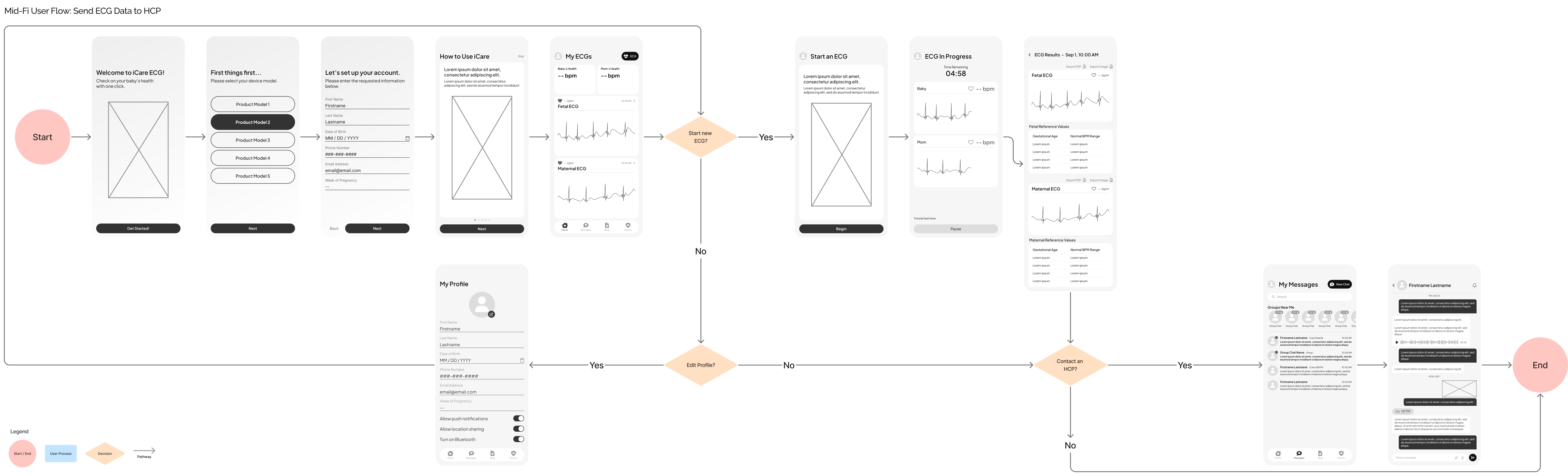
This is the task flow for onboarding a user, straight into sending new ECG data
to a healthcare provider through the app:
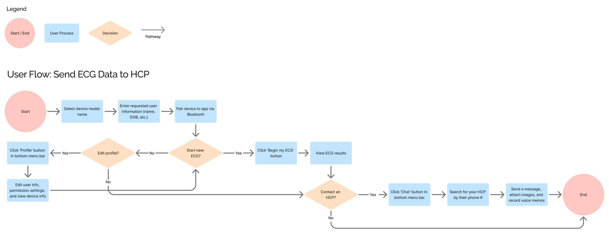
Allow users to start new ECGs and view previous ones.
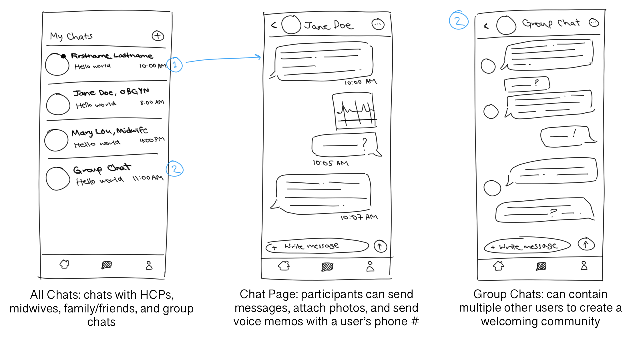
Send messages to midwives, OBGYNs, other users, and community group chats.
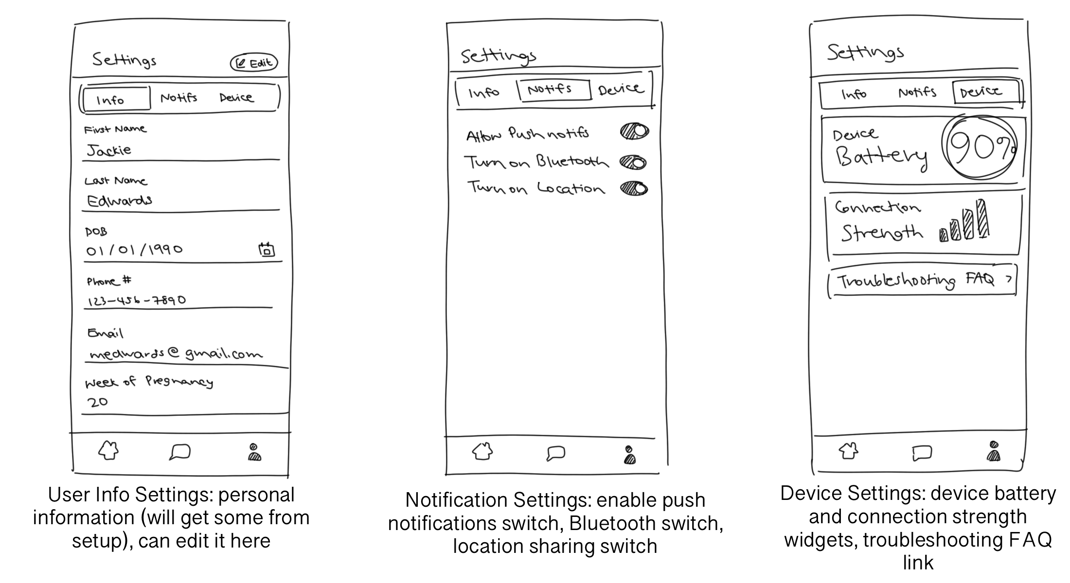
Edit user information, change various permissions, and view device status.
From these task and user flows, I began ideating on the designs of my main screens. I knew that I needed at
least four major pages: the Homepage, where the user would view and begin ECGs; Chats, where the user could
communicate with other users in direct or group chats; Settings, where the user could change their personal
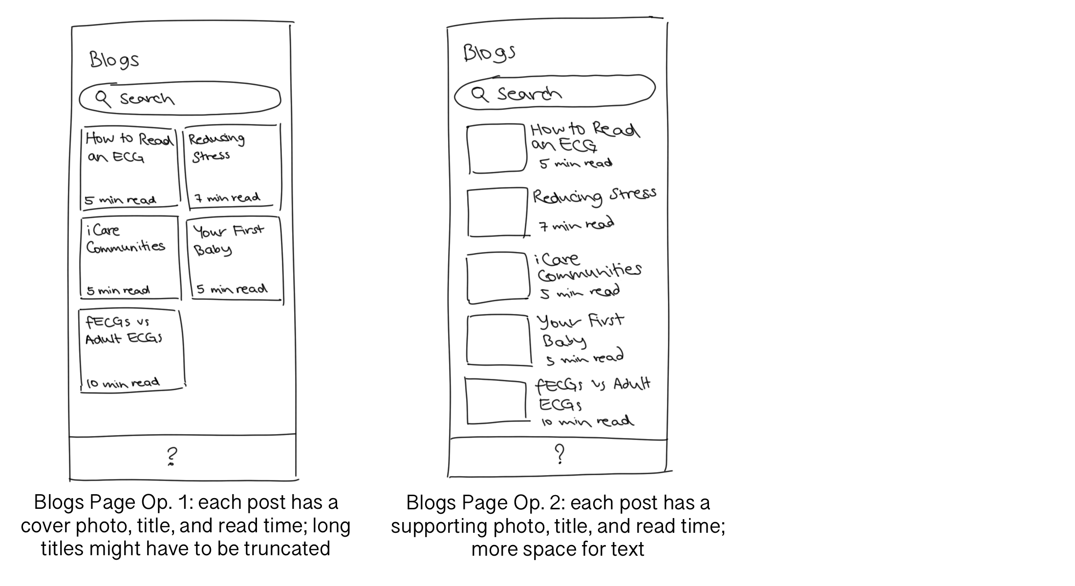
information, edit permissions, and view device information; and a Blogs or News page that contains
community-created posts that keeps all essential information in one place.
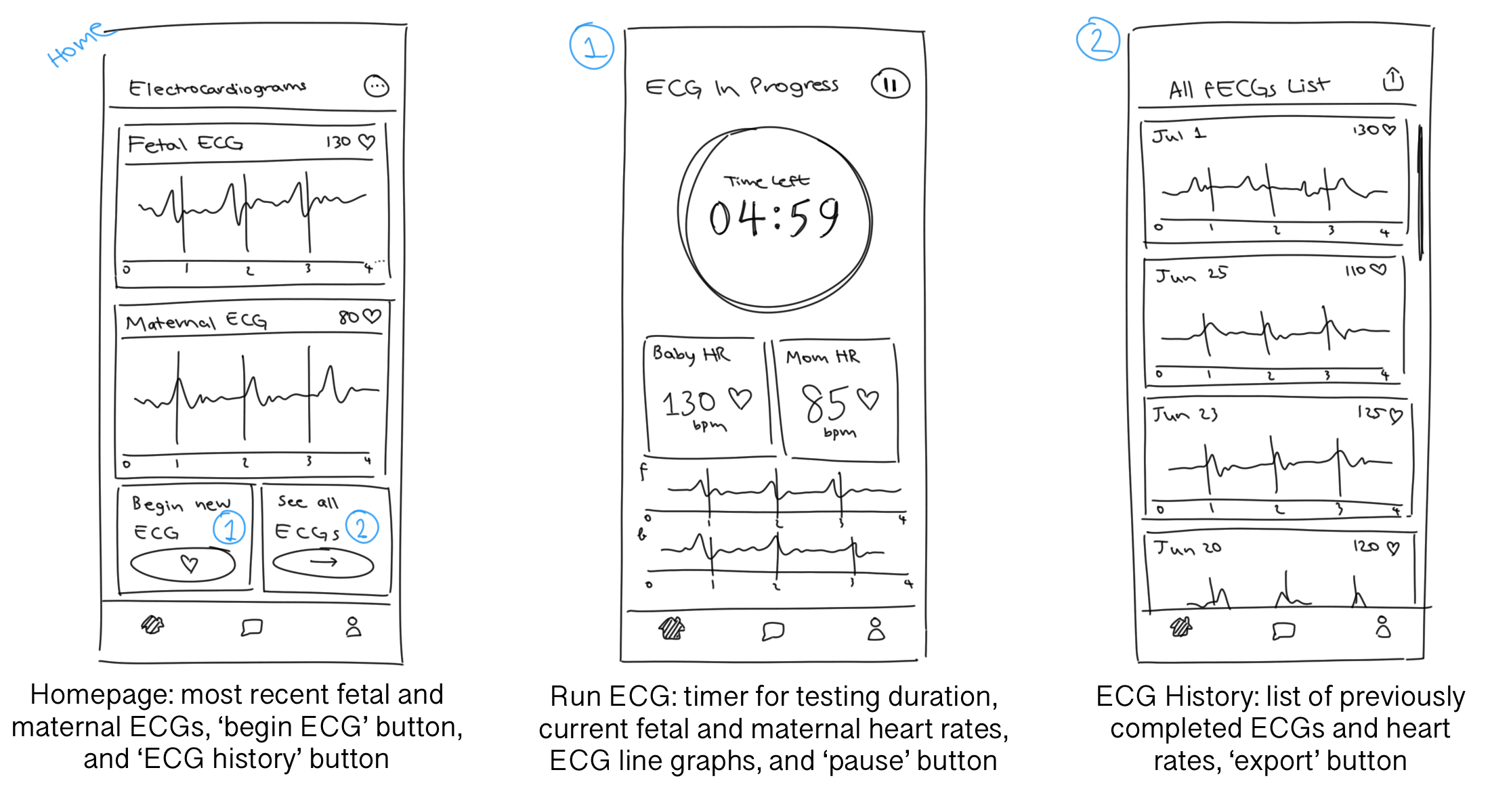
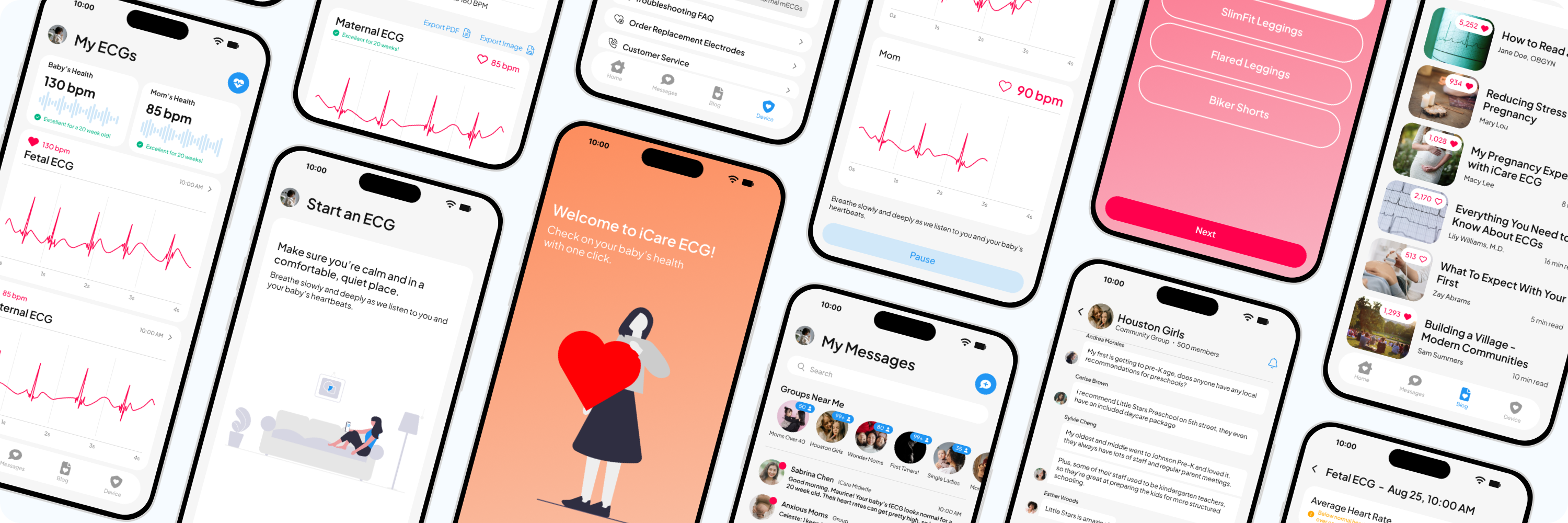
Here are the sketches I made for this step. I particularly liked the card interface that appeared on several
pages and kept information separate but united. I also needed to decide where I was going to put the Blogs
page, as well as if the Settings page should keep its segmented control menu or split into multiple pages.
At this point, I decided to ask for feedback from others. Since my peers were mostly college-age students who haven't experienced pregnancy or motherhood, I asked them to reach out to their moms, grandmothers, aunts, and anyone else who might have a use for this application. I also interviewed the mothers in my life and asked what they found useful and unnecessary in my rough drafts.
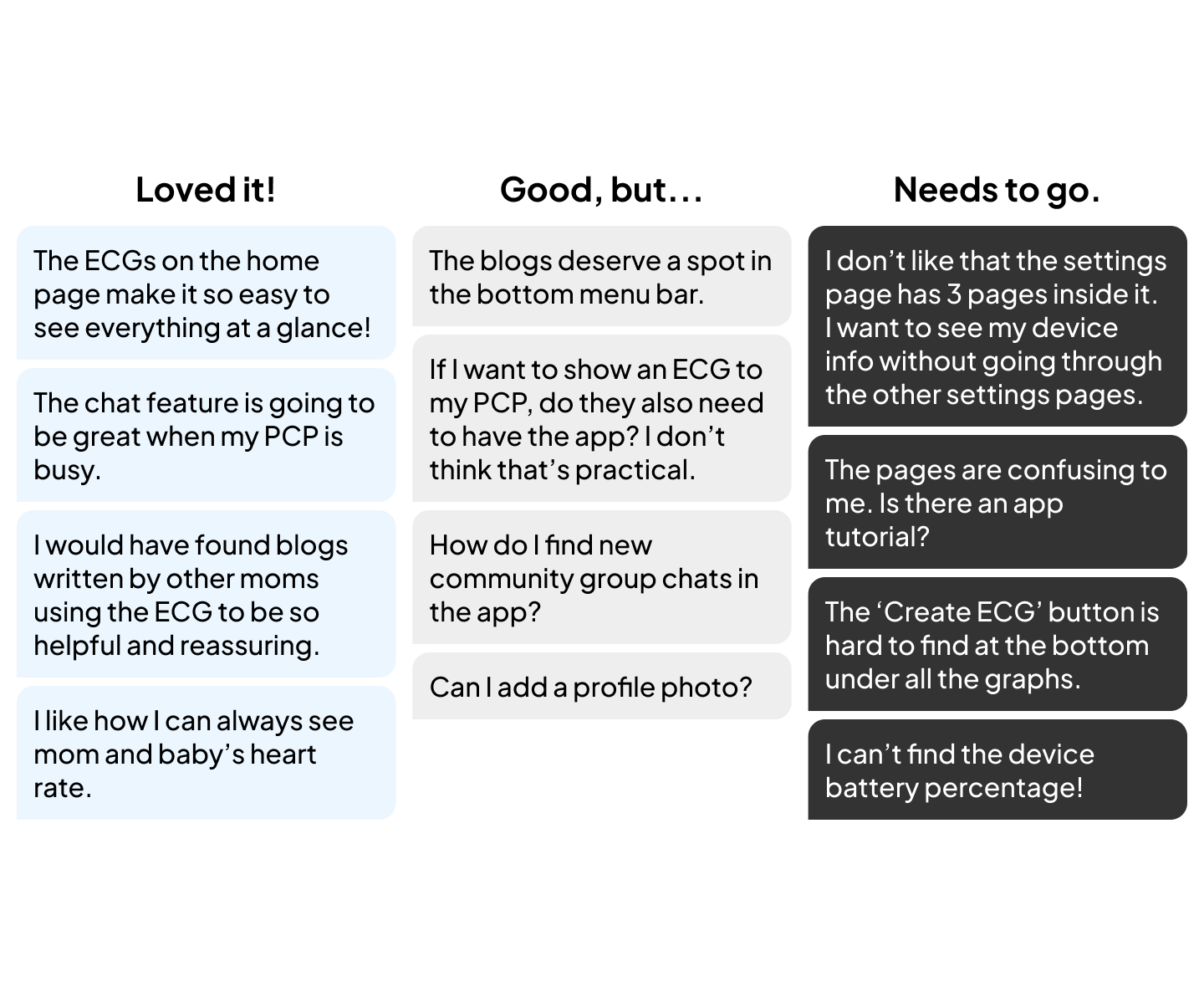
In the mid-fi screens, I made a few changes to the app layout to address user feedback and make the journey easier to follow.
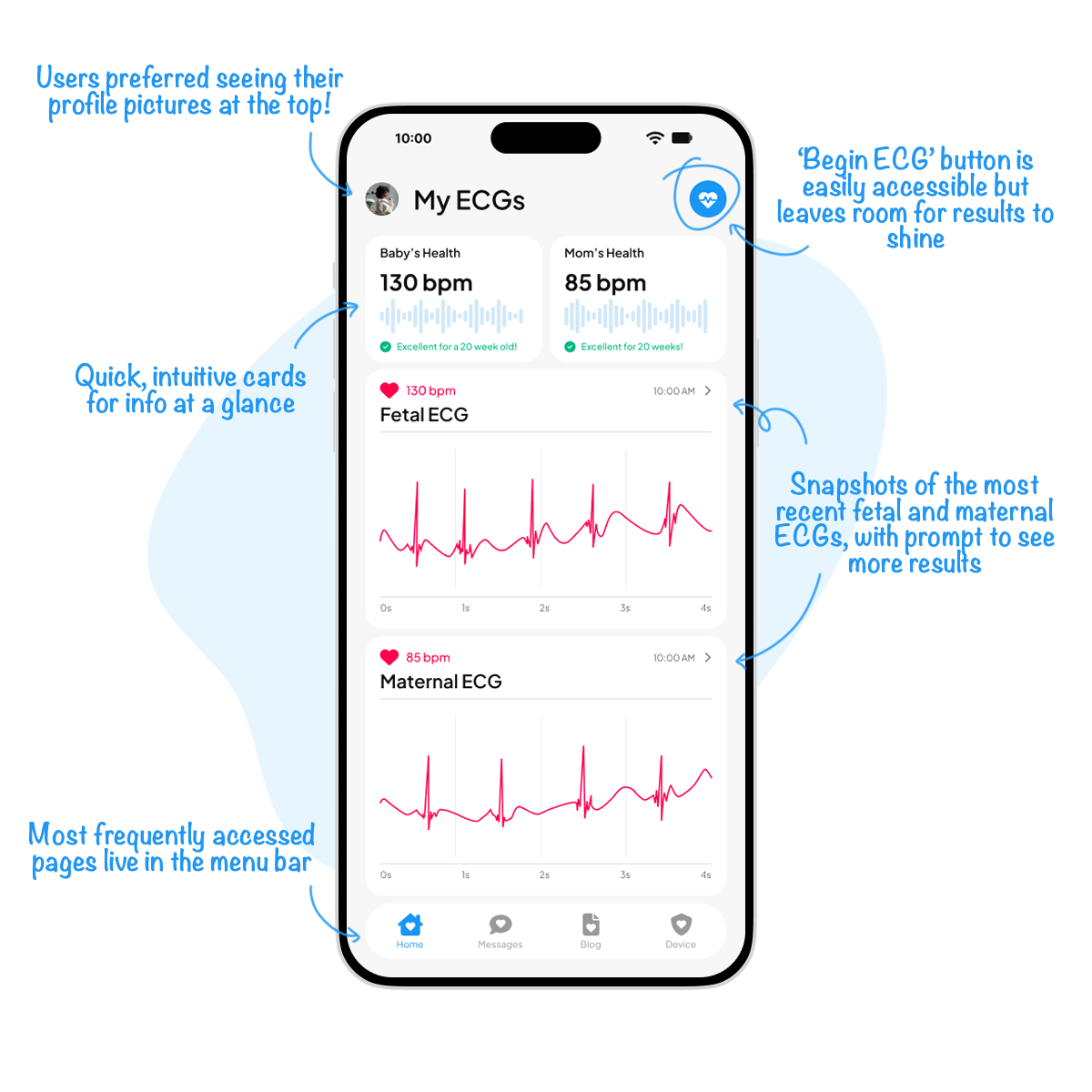
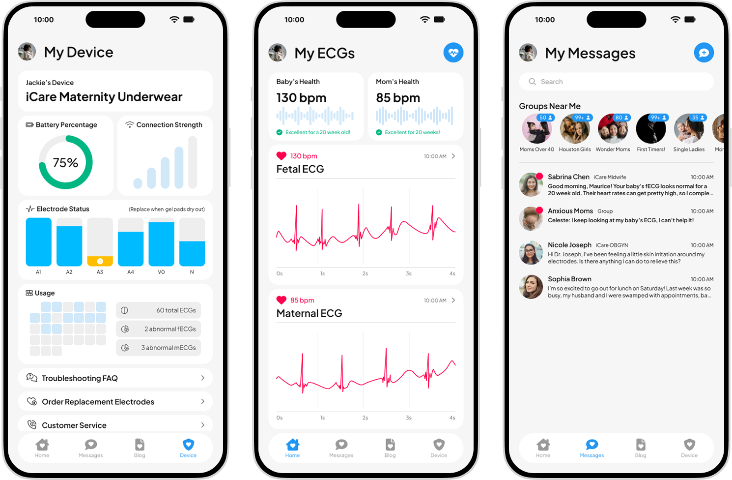
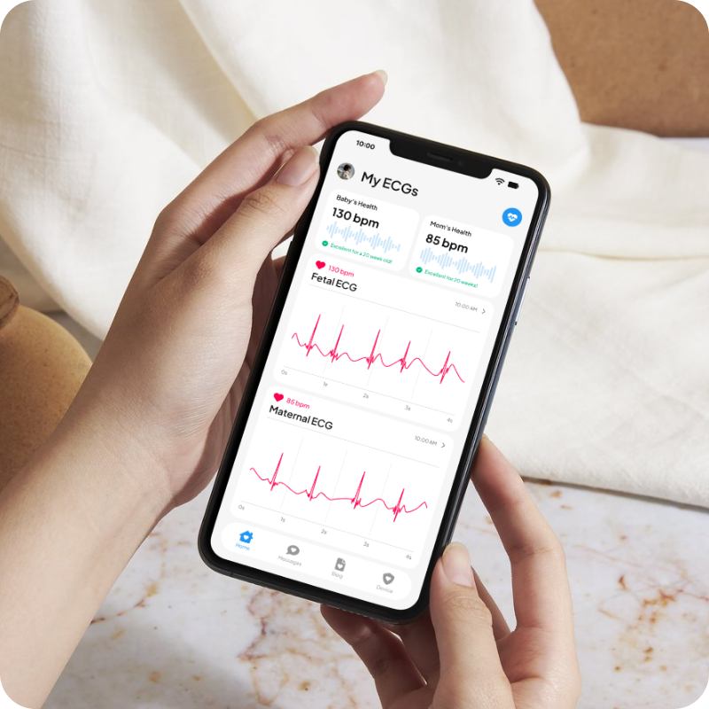
The home screen was designed to reassure users from the moment they open the app. Quick-view cards show the most recent maternal and fetal heart rates, and a single button makes starting a new ECG just one tap away. It's all about easy access to the information that matters most.
On the ECG record page, users can explore their full heart rhythm, reference normal ranges, and feel assured that important device details like date, time, and serial number are recorded. Export options make it simple to share results with healthcare providers inside or outside the app.

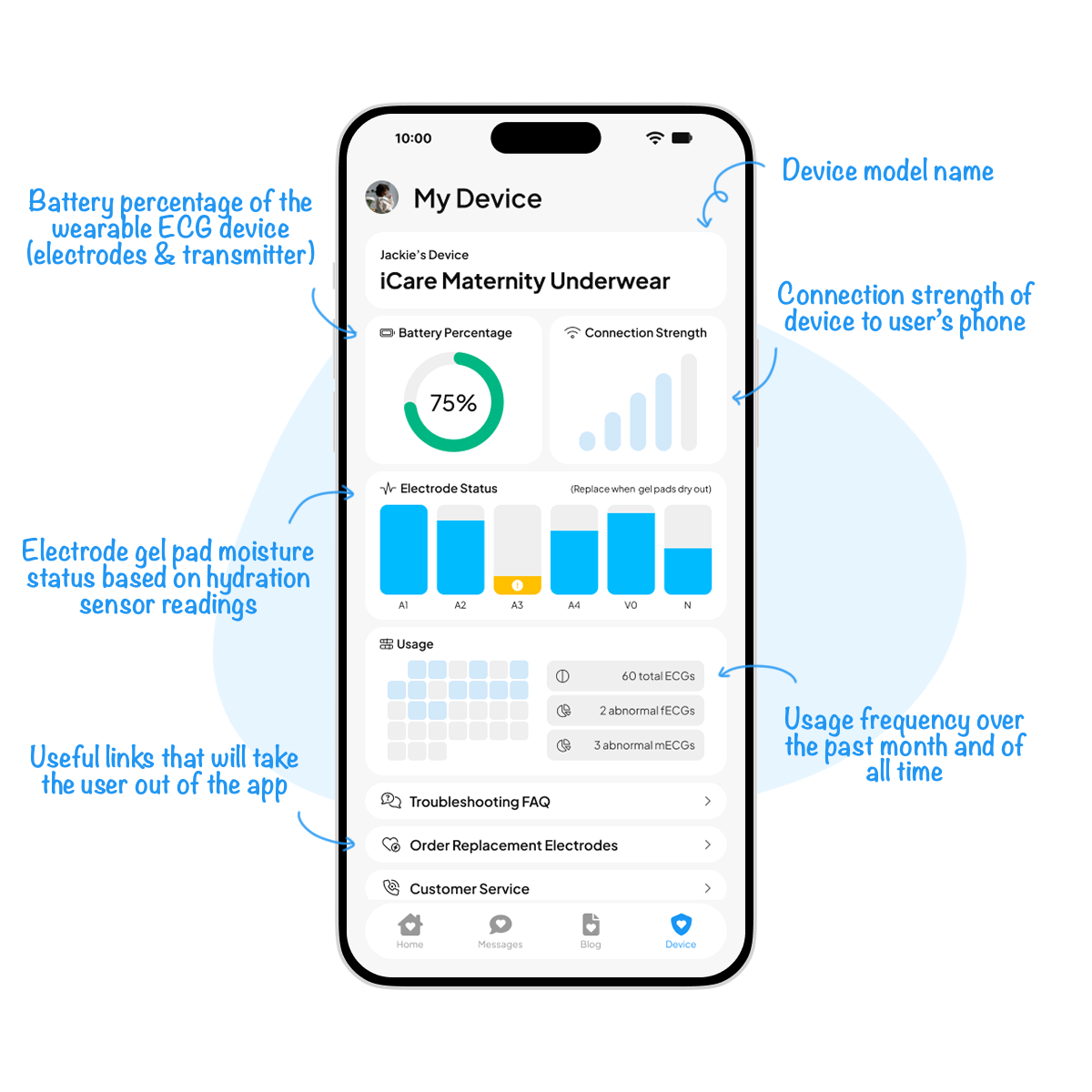
Since the hypothetical ECG device itself doesn't have a display, this screen gives users everything they need to stay in the know. From battery life and connection strength to electrode pad hydration and usage stats, it's a one-stop hub for keeping the device reliable and ready.
Since this was a conceptual project, I wasn't able to test with real customers. If I
had the
opportunity to do so, I would focus on evaluating both usability and long-term
engagement.
For
example, I would want to measure how quickly users can complete an ECG, whether they feel reassured
after viewing their results, and how often they return to view their ECG history. Other metrics
could include the percentage of ECGs exported to healthcare providers, average session time, and
retention rates over multiple weeks.
These data points would help validate whether the app
delivers
both peace of mind and practical value.
There are several areas where the app could evolve. For example, I could expand the
history section
into more robust trend visualizations, helping users see how their health changes week by week.
Integration with additional wearables or pregnancy-tracking tools could also make the experience
more seamless.
On the device side, future opportunities could include smart notifications
that guide
users when electrodes need replacing or when repeated abnormal results might warrant immediate
contact with their healthcare provider.
Designing this app taught me the importance of balancing medical clarity with
emotional reassurance.
Expecting mothers need not only accurate data, but also an interface that communicates care, calm,
and trust. I also learned how crucial it is to translate technical device details into plain,
user-friendly language: every feature needed to feel approachable, not overwhelming.
If I
were to
revisit this project, I would love to incorporate usability testing throughout the design process,
as even small
insights from potential users could sharpen decisions around content hierarchy and
navigation.
Overall, this project gave me a deeper appreciation of designing for sensitive,
high-stakes contexts
where empathy and usability go hand in hand.
Illustration Credit: unDraw
Stock Image Credit: Pexels